Image
Top
Navigation
January 19, 2015

The Retail Shift from Mdots to Responsive and Dynamic Serving


While most retailers still used dedicated mobile sites to power their mobile shopping in 2014, a significant shift is underway as retailers migrate towards responsive design and dynamically served mobile sites.

Based on mobile SEO audits Pure Oxygen Labs conducted across the top 500 retailers as listed in Internet Retailer’s 2014 Mobile 500 guide, here is how each of the three mobile web types that Google supports compared in popularity among retailers:
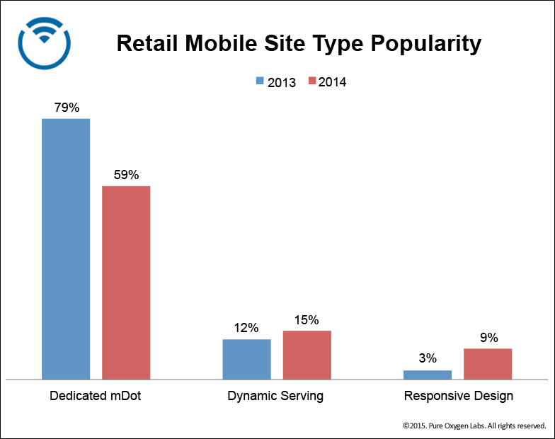
  • 59% used dedicated mdot sites – down (significantly) from 2013
  • 15% used dynamic serving – up slightly from 2013
  • 9% used responsive design – up (significantly) from 2013
  • 14% (shockingly) had no mobile web presence at the time


Retail Mobile Site Type Comparisons: Dedicated 'Mdot' Mobile Sites vs Dynamic Serving vs Responsive Design


Interpretations and Predictions

    1. Clearly dedicated mdot sites are falling out of favor as retailers look to more efficient and scalable methods of optimizing the shopping experience for more devices and with less effort. The fact that maintaining separate mobile URLs requires more effort to stay inline with Google’s mobile SEO policies is at least a motivating factor for some. More to the point, the perception has clearly taken hold that single-URL methods like responsive design and dynamic serving ultimately promise higher mobile SEO visibility (even if that is not the case). We expect mdot sites to fall to about 45-50% penetration among retailers in 2015.
    2. Interestingly, brands are moving towards responsive design, but it remains the least-used type. This comes as a surprise to some who want to believe responsive design has already reached critical mass. That’s not to say it won’t but it certainly hasn’t yet, and it likely will not among retailers until solutions exist for its Achilles’ heel: page speed. Retailers are right to be cautious about embracing responsive given the impact page speed has on online conversion and search rankings. All that said, we expect responsive to surpass 15% retail adoption in 2015.
    3. Dynamic serving saw a modest bump in popularity and is used more by retailers than responsive design. That too comes as a surprise, since dynamic serving garners nowhere near the same mindshare or buzz responsive design does. Yet this type will continue to increase in popularity among retailers, probably surpassing 20% in 2015. Why? It presents retailers with the “Goldilocks” solution: mdot pages are speedy, but use separate URLs and are harder to optimize; Responsive pages are integrated for easier maintenance and SEO, but slow and overweight for mobile users; Dynamically served pages are the “just right” solution – combining the best of both for a single-URL, device-optimized layout and fast-loading pages that are easy to maintain and good for mobile SEO.


Getting Technical

Given this expectation that responsive and dynamic serving will continue to increase in retail popularity, a few technical points on how to identify and talk about both types:

    1. Because dynamic serving occurs – by nature – on the server, it’s all too easy for researchers to classify these sites as responsive design. After all, the page being studied will have the appearance of responsiveness – same URL across devices, with layout that appears to adapt between desktop and smartphones browsers. The page may even contain media queries in the HTML. Simple, right? Not so fast! To definitively say a page uses responsive, you have to know the content served to desktop devices and smartphones is the same. Otherwise, it is likely a dynamically served page. That’s one of the reasons we make mobile SEO auditing technology – to help marketers see this distinction. The approach we recommend is to compare the page size and weight simultaneously using both desktop and smartphone user agents. If there’s no significant difference then it can be classified as responsive. But if there is a significant difference in page size, it is technically a dynamically served page.
    2. This is an important distinction as retailers increasingly turn to “adaptive” techniques to serve content with images, scripts, and stylesheets that are optimized (different) across device classes. While these pages have all the external appearance and handling of a responsive page, it would be easy (but wrong) to classify them as responsive design. Since the desktop and smartphone content are different, the pages will ultimately be treated by search engines as dynamically served content, and will need to follow mobile SEO policies outlined for such.


A Dynamic Future

Responsive design may dominate today’s headlines, but among retailers dynamic serving is more popular. Expect to see that trend continue. Dedicated mobile sites were the industry’s first-generation mobile solution; responsive design represents the industry’s second generation. But like its predecessor, responsive has technical shortcomings of its own that quietly push retailers towards dynamically served solutions. And if done right, both approaches can also enable retailers to position themselves for maximum mobile SEO visibility with less effort than dedicated mobile sites.


Comments

  1. I’m the author of _Content Strategy For Mobile_ in which I outline a definition of adaptive content. I also host workshops and a podcast on responsive web design with Ethan Marcotte. I’d like to offer a clarification in the difference between responsive and adaptive.

    For a site to be responsive, it needs fluid grids, flexible images, and media queries. That’s it. Pretty sure the numbers cited here would be higher for responsive if this report used Ethan’s definition of what constitutes a responsive site.

    Responsive and adaptive solutions can work together; a site with adaptive content that meets the conditions above would still be considered responsive. This may seem like a nit-picky technical detail, but I know there is a genuine risk that companies treat adaptive and responsive as if they are in competition—when really they are just different tools in our arsenal, and many companies need both tools.

    Comparing the page weight at smaller and larger breakpoints doesn’t necessarily tell you if a site is adaptive. Appropriate use of media queries would produce a similar discrepancy in what gets downloaded. Yes, many responsive sites today do download the full content to every device, but that is an implementation flaw, not an indication that dynamic serving is the only solution for bloated pages.

    • Brian Klais

      Thanks, Karen! I appreciate your comments, and agree with much of what you’re saying around definitions. But I’d also add that, it matters how Google (and Bing) define both types too – in terms of authoring requirements that influence the market, and in terms of algorithmic capability to detect which type is used by a page for ranking purposes.

      Sites that use server-side techniques to adapt content will – in our view – by definition be judged according to Google’s dynamic-serving requirements (including adaptive sites). What’s not as clear at this point is, when those pages also feature responsive elements, to what extent Google will judge those pages according to their responsive requirements as well.

      Quick note on research methodology: pages were categorized as dynamic-serving if our desktop and mobile bot requests to the page encountered firstly, no mobile redirects, and secondly, a page where the version served to mobile bots weighed 25% less than the page served to desktop bots. If a page effectively weighed the same (that is, within 25%) and also served smartphone media queries to both smartphone and desktop bots, then it was classified responsive design. So while we didn’t break out “adaptive” as a category unto itself in the research, the methodology is still, in my view, robust enough to avoid overstating the case for either dynamic serving or responsive design.

      Thanks again for sharing your expertise! Brian

Submit a Comment

This site uses Akismet to reduce spam. Learn how your comment data is processed.