As the holiday season approaches, online retailers have all things mobile on their minds as ecommerce headlines are dominated by a wide range of mobile related trends including consumer behavior, cross-device advertising, Mobilegeddon, app indexation, deep linking and Google buy buttons.
A key decision for online retailers that can tie everything together (for better or worse) is choosing, implementing and evolving a mobile site strategy. In 2014, we reported that a significant shift is underway among Internet Retailer Mobile 500 companies as they migrate away from dedicated mobile or mDot sites towards responsively designed and dynamically served sites.
Once again we have conducted an SEO audit of all 500 sites to understand just how fast that migration is taking place and what technology is likely to be favored in the future.
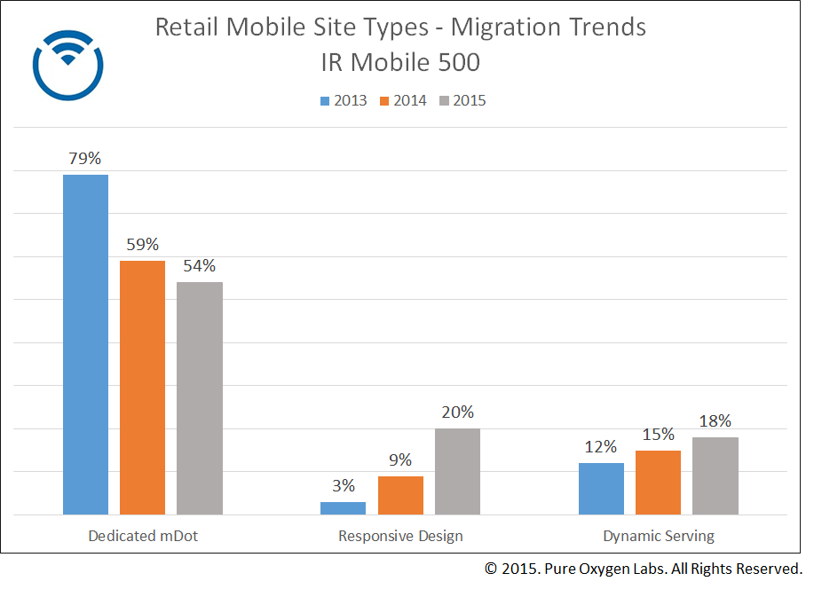
Here are the results and trends for 2015:
- 54% still use a dedicated mdot site – down from 59% in 2014
- 20% use responsive design – up significantly from 9% 2014
- 18% use dynamic serving – up slightly from 15% in 2014
- 5% or 25 sites have no mobile presence – down significantly from 14% in 2014

Interpreting the Trends
Google’s recent algorithm change (Mobilegeddon), no doubt added a level of urgency to mDot site migrations as retailers took a fresh look at their mobile strategy from a customer and SEO perspective. That algorithm change triggered updated search rankings based on a “mobile friendliness” score which likely drove some retailers to action. Beyond Mobilegeddon, however, let’s take a look at the trends that are influencing the move away from mDot strategies.
- Responsive Design Overtakes Dynamic Serving
Responsive design had a big year. The number of retailers using this method of site design jumped 109% to 20% of the IR Mobile 500. Responsive design delivers the same code on a single URL and automatically adjusts to display sizes which don’t rely on the user to zoom or scroll horizontally. The downside to responsive design has been the potentially high page-load times on mobile. The gains in adoption, therefore, could be a sign that retailers have overcome that hurdle as they optimize site content. What is surprising, however, is that responsive design has overtaken dynamic serving which allows for a more mobile-centric experience as different HTML and CSS can be served on the same URL. At this point in time, it seems simple implementation and maintenance (responsive design) outweighs a truly customized mobile experience (dynamic serving) which would require more technical resources to implement and maintain.
- mDot Sites Still Dominate
The move away from mDot sites is proceeding slower than some have predicted. More burdensome to maintain, mDot sites are losing ground to the single URL strategies offered by responsive design and dynamic serving. Some may wrongly perceive, however, that mDot sites are not SEO friendly or create problems with duplicate content which is not the case. Implemented correctly, mDot sites are not only fast, they still score high points with Google and subsequent search rankings. The slow migration away from mDot sites may also indicate that retailers are incorporating elements of responsiveness into these sites to adapt to small screens as a way to get more out of their investment before migrating to a new strategy.
- Dynamic Serving Sees Steady Gain
Dynamic serving saw another modest YoY gain in adoption. While responsive design gets all the buzz, dynamic serving offers retailers the best solution because it allows them to customize the user experience using different HTML and CSS on the same URL. This optimized layout approach offers fast-loading pages which logically leads to happier customers and higher conversion rates. So why aren’t more retailers adopting this strategy? The reason can be summed up in one word: resources. Dynamic serving takes more coordination among developers and more effort in customizing code to serve up to different user agents.
Consumers: The Ultimate Change Agents
Responsive design and dynamic serving will continue to gain ground as retailers become ever more focused on user experience across devices. The question then becomes is responsive design “good enough” or is dynamic serving a question of “when” not “if”? The answer for any retailer can be found in consumer behavior. As consumers become more comfortable using their mobile devices to buy across product categories they are also likely to become less tolerant of ecommerce experiences that are less than perfect.
Comments